display Property
With this we control how an element is rendered:
- inline: default for most elements, no size, no margin & padding
- inline-block: like inline but with margin & padding
- none: doesn't get rendered at all
- and more (important ones)…
display: block
- Displays an element as a block element
- Element starts on a new line and takes up the 100% width
- block is vertically oriented (stacked)
- This is the default for some elements, has size and margin & padding.
block challenges
- how to center element within another?
- how to handle dynamic element sizes?
- how to layout elements horizontally?
Flexbox layout (Flexible Box)
The flexbox layout aims to provide an efficient way to layout items in a container, even when their size is unknown.
- Flexbox is mainly a single-direction layout concept
- It has a main axis and a cross axis
- We can choose whether the main axis is horizontal (default) or vertical

Flex Container
The container that is styled with display: flex or display: inline-flex.
              .flex-container {
                display: flex;
              }
Flex Item
Any element that is a direct child of a flex container.
                    .flex-container {
                      display: flex;
                    }
                      Flex Item 1
                      Flex Item 2
                      Flex Item 3
display: flex
                    .parent {
                        display: flex;
                    }
                    <div class="parent">
                      <div>Item 1</div>
                      <div>Item 2</div>
                      <div>Item 3</div>
                    </div>
main axis from left to right
Flexbox has some properties for the parent container and some for the individual items
justify-content
Controls how elements are layouted along the main axis
                    .parent {
                        display: flex;
                        justify-content: flex-end;
                    }
                    <div class="parent">
                      <div>Item 1</div>
                      <div>Item 2</div>
                      <div>Item 3</div>
                    </div>
justify-content: most used values
align-items
Controls how elements are layouted along the cross axis
                    .parent {
                        display: flex;
                        align-items: flex-start;
                    }
                    <div class="parent">
                      <div>Item 1</div>
                      <div>Item 2</div>
                      <div>Item 3</div>
                    </div>
align-items: most used values
What if we want to layout vertically instead of horizontally?
We can switch the main and cross axis with flex-direction!
flex-direction
Controls which axis is the main axis (horizontal/vertical)
flex-direction
It's also possible to reverse the direction
flex-direction
hint: flex-start and flex-end are also reversed
                    .parent {
                        display: flex;
                        flex-direction: row-reverse;
                        justify-content: flex-end;
                    }
What if we don't want to layout all items along the cross axis the same way?
align-self
controls alignment along cross axis for individual element (similar to align-items)
                    .parent { align-items: flex-start; }
                    .child-end { align-self: flex-end; }
                    <div class="parent">
                      <div>Item 1</div>
                      <div class="child-end">Item 2</div>
                      <div>Item 3</div>
                    </div>
flex-basis
Sets the initial size of a flex item along the main axis - useful in combination with flex-grow (next)
What if we want to make sure that the items use up all the available space?
flex-grow
- controls if and how an item grows to use the remaining space (container size minus all item sizes)
- space is distributed according to proportion defined by flex-grow
flex-shrink
- controls if and how an item shrinks if all items combined are larger than the container
- children with a higher value for flex-shrink shrink more
What if we change the order in which individual elements appear?
order
- child elements can have an individual order
- default is 0
                    <div>
                        <div style="order: 1">order: 1</div>
                        <div style="order: 5">order: 5</div>
                        <div style="order: -1">order: -1</div>
                        <div style="order: 3">order: 3</div>
                        <div style="order: 2">order: 2</div>
                    </div>
(press down to hide this)
What if we have too many child items for one line?
flex-wrap
Controls if and how elements are wrapped on new lines
gap / row-gap / column-gap
Control the gaps between rows and columns
                    .parent {
                        display: flex;
                        align-items: flex-start;
                        flex-wrap: wrap;
                        row-gap: 30px;
                        column-gap: 10px;
                    }
align-content
Control how extra space on the cross axis is allocated
(press down to hide this)
Build person card

Laura Roberts
Member since 2015
4600 Olten
Offers
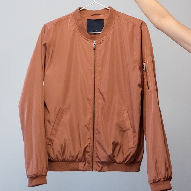
Vintage Jacket
CHF 65
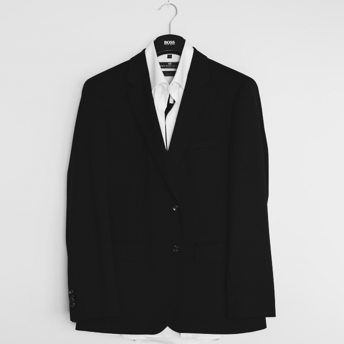
Blazer Black
CHF 115
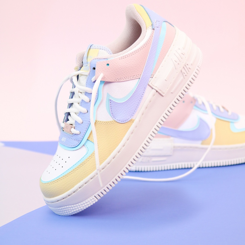
Nike Air Force
CHF 95
Go to the code sandbox and try to build the person tile after the design from figma
Build person card
Laura Roberts
Member since 2015
4600 Olten
Offers
Vintage Jacket
CHF 65
Blazer Black
CHF 115
Nike Air Force
CHF 95
                        .personal-header {
                            display: flex;
                            align-items: center;
                            gap: 16px;
                        }
                        .product {
                            display: flex;
                            align-items: center;
                            gap: 16px;
                        }
                        .actions-container {
                            display: flex;
                            justify-content: space-between;
                            margin-top: 24px;
                        }