CSS for Developers
Various topics
Design Principles
at-rules
at-rules
They start with an @ and are special instructions to provide:
- meta information
- conditional rules
- descriptive expressions
Imports
Include style rules from other CSS files with @import:
@import url("my-imported-styles.css");
Media Queries
Media Queries (with @media (condition) {…}) are used to style elements depending on certain features, like ...
... width of screen
                    .card-container {
                        display: flex;
                        flex-direction: row;

                        @media (max-width: 600px) {
                            flex-direction: column;
                        }
                    }
... print view
                        @media print {
                            .advertisement {
                                display: none;
                            }
                        }
… and many more
Container Queries
Container Queries are similar to Media Queries, but depend on a defined container instead of the full viewport.
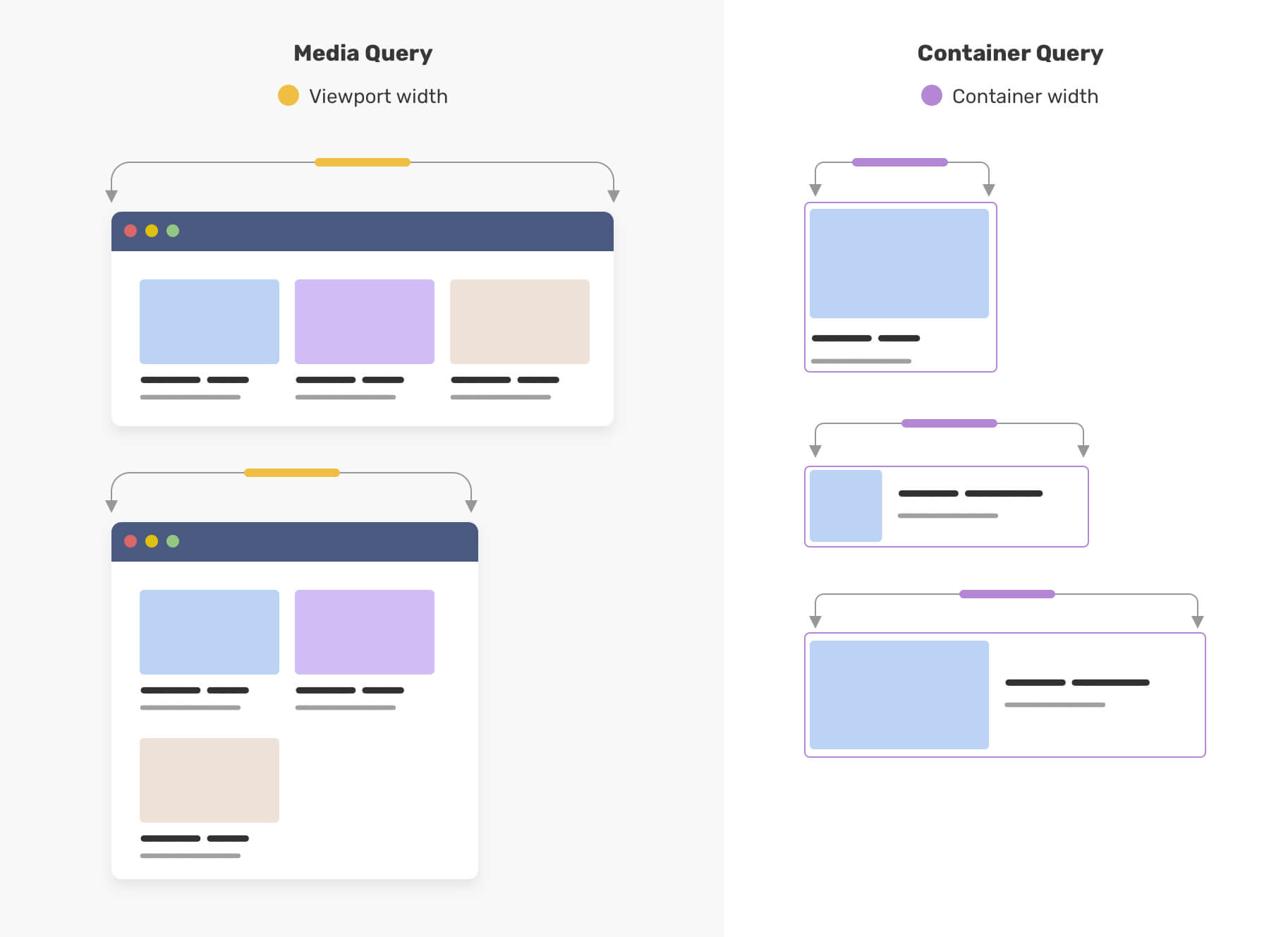
                                ...
                                ...
                        .card {
                            container-type: inline-size;
                            container-name: card;
                        }

                        @container card (inline-size < 235px) {
                            .details {
                                font-size: 1rem;
                            }
                        }
Helpful resources for more in-depth information about container queries:
Font Face
@font-face can be used to specify custom fonts.
                    @font-face {
                        font-family: "Inter";
                        font-style: normal;
                        font-weight: 100 900;
                        font-display: swap;
                        src: url("InterVariable.woff2") format("woff2-variations");
                    }

                    body {
                        font-family: "Inter", sans-serif;
                    }
Feature Queries
Apply rules based on browser support with @supports.
                    @supports selector(h2 > p) {
                        /* CSS rules using this kind of selector … */
                    }
                    @supports (display: flex) {
                        /* CSS rules using flex features … */
                    }

                    @supports not (display: flex) {
                        /* CSS rules with alternative solution if flex is not available … */
                    }
And of course there are more …
see the full list on MDN
CSS Animations
With CSS complex animations can be created. Two main types:
- Transitions
- Animations
Transitions
Normally, style changes are instant. With transitions it is possible to transition smoothly between the two styles
Transition triggers
A transition needs a state (style) change and an event that triggers it. Examples of possible triggers:
- :hover pseudo-class
- :focus pseudo-class
- class change from Javascript
<div class="colored-border">Hover over me!</div>
                .colored-border {
                    background-color: #ff9900;
                    transition: background-color 1s;
                }
                .colored-border:hover {
                    background-color: #0099cc;
                }
The property transition (also a shorthand) allows for some simple animation between different states of other properties:
transition: property duration easing timing-function delay;
- property: which property should be transitioned? e.g. background-color
- duration: how long should the transition be? e.g. 2s
- easing: what kind of transition? e.g. linear
- delay: should the transition only start after an initial delay? e.g. 1s
Animations
- With animations more complex animations can be created
- Animations are specified in keyframes and then applied to elements
                        @keyframes move {
                            0% { transform: translateY(-100%); }
                            70% {
                                background-color: #ccff00; /* green */
                                transform: translateY(0);
                            }
                            100% { background-color: #0099cc; } /* blue */
                        }
                        .moving-container {
                            background-color: #ccff00;
                            animation-name: move;
                            animation-iteration-count: infinite;
                            animation-direction: alternate;
                            animation-duration: 2s;
                        }
Many different configuration options, we don't go into detail here
Check out the good documentation on MDN
Easing
Animations can be eased. The interpolation is by default slightly eased but can be configured with animation-timing-function.
Easing
What can be animated?
Generally all properties that have a 'middle state' can be interpolated. Example:
- font-size (12px -> 16px), middle state is 13px-15px: animation is possible
- font-family (Helvetica -> Times New Roman); no clear middle state: no animation is possible
Animation performance
If possible: animate properties which do not trigger layout or paint
                        @keyframes animate-fast {
                            0% { transform: scaleY(0); }
                            100% { transform: scaleY(100%); }
                        }
                        @keyframes animate-slower {
                            0% { height: 0; }
                            100% { height: 100%; }
                        }
Which properties? Check here
Stacking contexts
What if we want to display an element above another?
z-index
The z-index specifies the stack level of the element in the current stacking context
                <div style="z-index: 1">z-index: 1</div>
                <div style="z-index: 3">z-index: 3</div>
                <div style="z-index: 2">z-index: 2</div>
                <div style="z-index: 1">z-index: 1</div>
Stacking context
z-index is not global, it is in relation to the current stacking context. A stacking context is formed on the following elements:
- on the root html element
- on an element with a position value of absolute, relative and a z-index other than auto
- on an element that is a child of a flex/grid container
- many more, see MDN
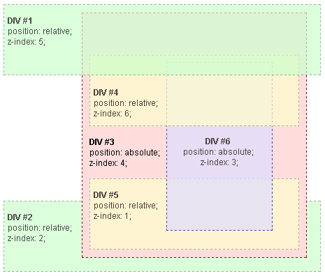
In this example, every positioned element creates its own stacking context, because of their positioning and z-index values
Accessibility
Accessibility
Roughly 20% of the world's population is affected, but most people are affected at least temporarily to some degree (injuries, situational).
Accessibility is a big subject and a certain level (WCAG 2.1 AA) is required for some applications in the EU and CH. We cover some tips here.
Use semantic elements
Semantic elements help screen readers (and also SEO)
Keep element hierarchy consistent
Example: the order of headings should always be consistent:
Wrong: <h1> → <h3> → <h4> → <h5>
Correct: <h1> → <h2> → <h3> → <h4>
Keyboard navigation
- Not all users can use a mouse
- Make navigation through application (especially forms) possible with just the keyboard
- Navigation with the tab key should be possible
- Make sure focus state is visible (use
:focus-visible)
Check touch targets
Check that click / touch targets are at least 9mm high by 9mm wide
WGAC Target Size Spec
Colors
Properties to set colors:
- color (text color)
- background-color
- border-color
They take:
- named colors (e.g.
red) - RGB as hexadecimal (e.g.
#ff0000) - … or with
rgb(255, 0, 0) - other formats (
hsl(),hwb())
Use of color
- Use more than color to convey information (e.g. red green for okay / not okay)
- Make sure to use strong contrasts between important colors. Color contrast checker